Taking marketing to a new level....all the way to the top
 Which ever way you voted, one thing that I think everyone can agree with is that Barack Obama, or his team, really know how to build a brand. And long before Nov. 4th, he had already won, the ANA Marketer of the Year award.
The Web Marketing Association also weighed in with their poll, in which Obama once again dominated. Check out the site for more information, but here are some of the stats:
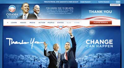
Design - Asked "which Website has the most pleasing design?" WebAward judges selected the Obama site 4 to 1 over the McCain Website. 84.5% of them voted for Senator Obama's Website and 15.5% selected Senator McCain's Website as better looking.
Innovation - Website innovation also went in favor of Barack Obama. By the same margin as design, the vast majority of WebAward judges (82.4%) thought the Obama Website seems more innovative, while only 17.6% favored McCain's.
Content - In terms of having the most appealing content, judges again selected the Obama Website over John McCain 's Website, although by a narrower margin than the first two criteria. 71.6% of the WebAward judges felt barackobama.com has more appealing content for visitors compared to 28.4% for johnmccain.com. WebAward judges also found that the Obama Website is more effective for telling the candidate's story and attracting contributions and voters to its cause (72.2% Obama vs 27.8% McCain).
Ease of use - Senator Obama's Website was seen as easier to use by the WebAward judges than Senator McCain's. 73.8% selected barackobama.com as easier to use compared to 26.2% of WebAward judges who felt johnmccain.com was easier.
Copywriting - It is obvious that both campaigns have excellent writers on staff. Neither Websites have any of the editing issues some large organizations can experience. However, the WebAward judges gave the advantage to the Obama site (70.1% over the McCain site 29.9%).
Interactivity - Interactivity makes a Website more than just an online billboard and both candidates were effective in giving visitors to their Websites plenty to see and do. Nevertheless, once again the WebAward judges gave the edge regarding interactivity to the Obama Website (75.2%) over the McCain Website (24.8%).
Technology - Use of technology is evident in both candidates' Websites, however, the clear favorite for the WebAward judges was barackobama.com winning 82.4% of the votes compared to johnmccain.com with only 17.6% of the votes.
Looks like from that data, the election was definitely a digital landslide.
On the eve of the election, after Obama had been declared the winner, the stage, literally, was noticeably changed. As we watch the crowd await the victory speech there were a number of observations which I made:
The simplicity of the staging. Throughout the campaign, we saw really beautiful staging, elaborate, with beautifully integrated digital elements, and backdrops. For the speech, we see the first family elect on stage flanked by nothing but a simple backdrop nicely uplit and a number of American Flags. Gone were the big Obama banners, the ever consistent podium sign, the larger signs around the base of the podium. Very stark in contrast from the staging we have seen throughout the campaign.
Obama-Biden signs in the crowd. You didn't see any. We have gotten accustomed to seeing them in the large crowds, everyone surrounding them holding them and turning them around to see the current messaging reflected on them. Tuesday night, all we saw was the American flag.
So from the master of the brand, why this absence of the brand? Very intentional I believe. Up until that point, he was in a battle, a contest for the election. He had an adversary which he needed to distinguish himself from. At the moment of the acceptance speech, that battle was won, the need to distinguish himself, no more. The task at hand from that point on was to unite, to put the battle of the election behind and to move forward. The absence of his brand, was for us, that visual cue of a new era.
The "new" brand is that which we all know, that of "the United States of America." A brand that perhaps is in need of a bit of a make over. And who better to do it.
Now back to the website, one of the beauties was the fundraising capacity, he was the master in this. Unprecedented numbers of people donating to the campaign. But now what? He has a beautiful list of people who are willing to give of themselves to make a difference. Will the next president capitalize on that?
Would the American people be willing to give of themselves and their wallets for change in a cause they believed in? Would Americans open their wallets and donate $25 or more dollars towards the funding of the inauguration ceremonies, for a chance to attend? In an era of fiscal restraint, would it be an effort to show how we can motivate individuals and help to trim some of the fat out of Washington?
 Brenda Levos
Reader Comments