 I loved this site so much I am posting it twice, once on the home page and then again in the Websites We Love category.
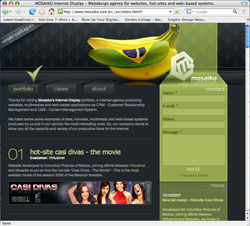
One of the things that web designers stuggle with is how to make a webpage more dimensional. How do you add depth to something that is so flat, especially when you have do accomodate navigation on multiple pages or you are working with a templated site. I thought this site did an excellent job of all of that. The textured background in the header, and the way the stripe comes down and becomes the right navigation, all while utilizing a vanishing point and placing the banannas so that they slightly overlap the right stripe with their little reflection and the shadowing and interaction with the 3D logo.
If you break down the page, you could easily achieve this kind of a look with one large header image, and then a standard template for the lower portion. As you move from page to page, you would need to make sure that you move the checkmark above the navigation tabs. So with three different header images, you could achieve a similar look. Note how the bottom 2/3 of the page are still very flat looking, but the header certainly makes the whole site.
Visit the Mosaiko site at http://www.mosaiko.com.br/_en/index.html?r